Increasing user engagement in Productboard's Insights
Case study: Increasing user engagement in Productboard by adding an analytical layer to Insights.
Productboard is a B2B product management platform enabling all product makers to consolidate customer insights, prioritise what to build next and align others around the plan.
In spring of 2021, I was part of a team working on the Insights solution within Productboard. At the time:
- User engagement with Insights was slowly declining, especially in strategic upmarket segments. Yet the customers who were highly engaged with Insights were the healthiest accounts with high retention.
- Insights had a low time to value: There was a lot of manual processing and very little feedback analysis possible for product managers.
Objectives
Company's goal at the time was to build a repeatable upmarket business. To support it, my team was given these objectives:
Business objective: Increase user engagement with Insights.
Product objective: Make it easier to discover new opportunities from feedback and insights.
Our target key result was a 12% increase of Weekly Active Users of Insights.
My role
- Worked with a cross-functional product team consisting of a product manager, engineering manager and four engineers, one of which was the lead engineer for this initiative.
- Researched the problem with the PM → Identified clear jobs-to-be-done to solve for.
- Collaborated with the product trio (PM and engineering lead) → Defined a viable solution together.
- Designed and tested the solution (both for value and usability) → Validated the solution with customers.
- Iterated on the solution during beta phase → Improved solution discoverability and usability.
- Designed marketing collaterals → Supported the marketing launch that was key in the initiative's success.
Outcome and impact
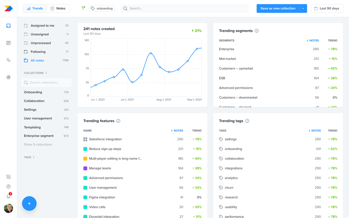
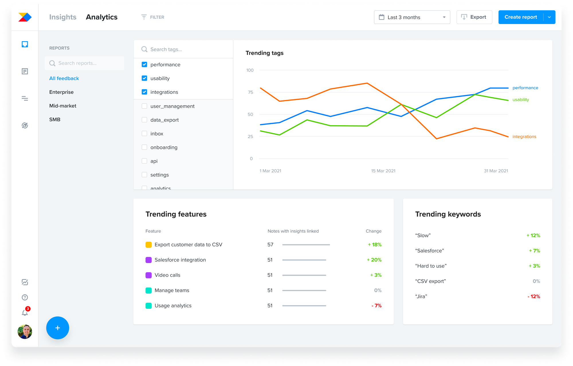
At the end of 2021, we shipped Insights Trends – analytical layer on top of notes where product managers could see trending features, tags, segments and find new opportunities from customer feedback.
Within 3 months after the launch, we achieved a 31% increase of weekly active users of Insights. The initiative was a resounding success.
In the rest of the case study, I will tell a story of how we got there.
Product vision for Insights
In early 2021, I collaborated with the pillar's product and design leadership on crafting the product vision for Insights.
The Insights board in Productboard was originally built for smaller teams and its main value was in centralising feedback from many different sources into one repository. As Productboard grew larger, and larger organisations began using it, the volume of feedback collected started to outgrow the solution. Many customers viewed it as a mere inbox and didn't consider it as a place for learning.
We crafted a vision for working with feedback at scale was easy and less manual. We wanted the Insights board to be a place for identifying opportunities, a place that enabled our customers to continuously learn about what their users need.
Discovering the right direction
With the product vision in mind, my team started reviewing what we knew. I synthesised existing feedback around this problem and identified patterns in it.
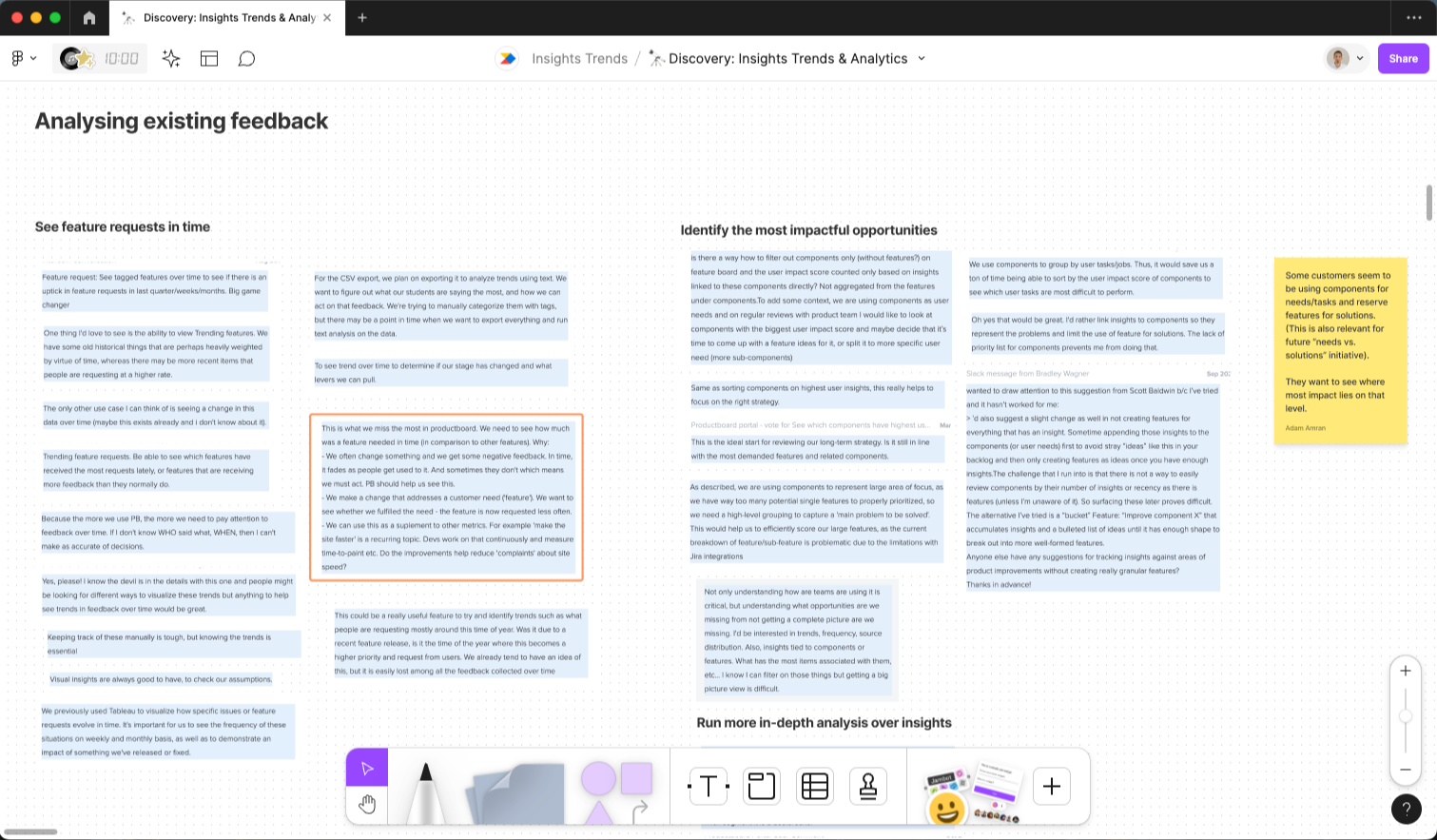
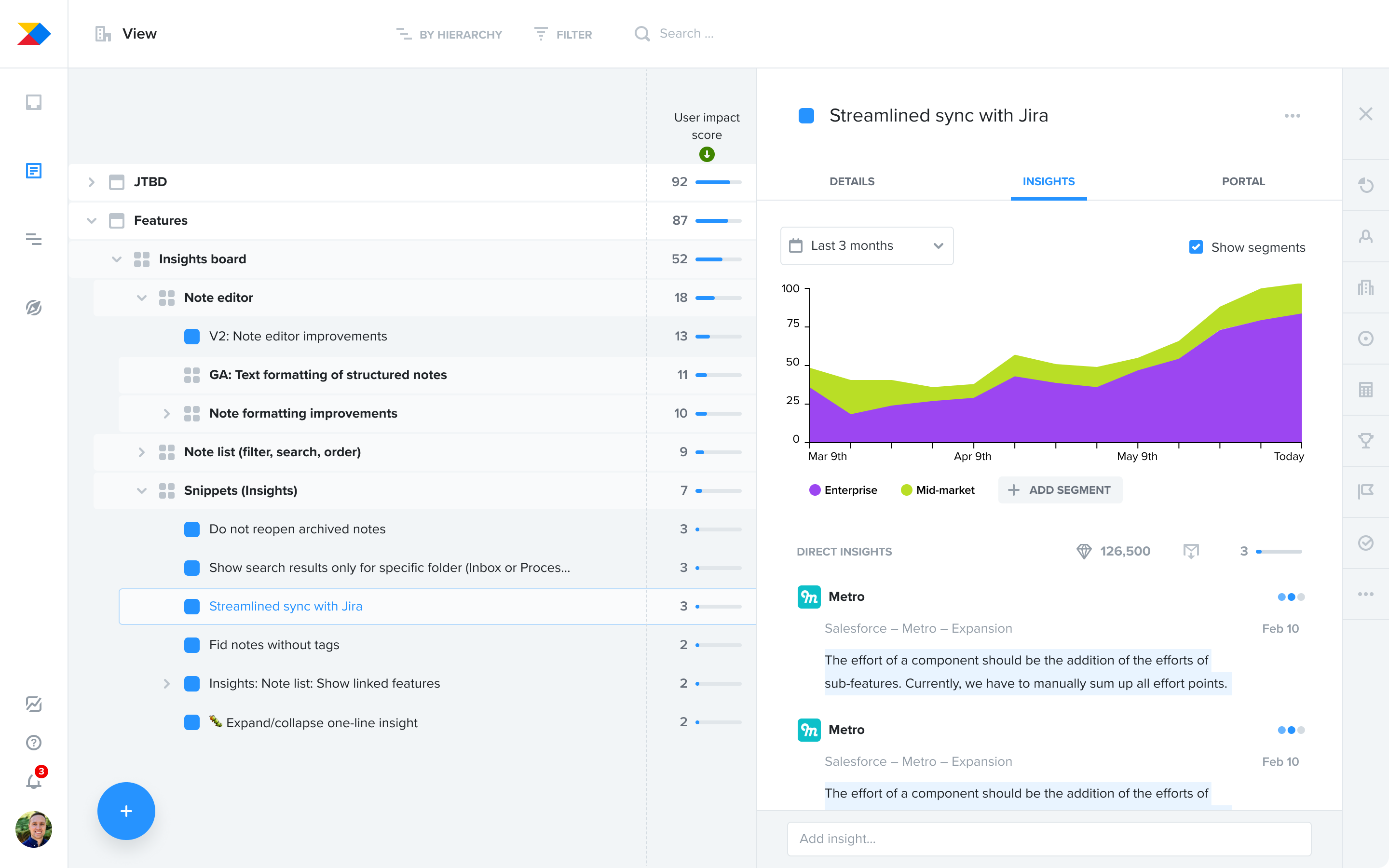
Many customers were already using a feature to help scale feedback: User Impact Score on the Features board, a number that aggregates the volume of feedback and its importance, linked to individual features.
That said, we learned from existing feedback that customers had a hard time learning about the trend in time. They were unsure whether a customer need was growing or if a feature was generating more or less feedback after a release. It was also hard for them to answer questions like “What is our target segment asking for?” and “What topics are coming up recently in my product area?” without a lot of manual work, including diligent linking of feedback to feature ideas.
We needed to learn more about the key jobs-to-be-done, but we also had some early ideas that we wanted to test. We talked to our customers, combining traditional research interviews with early concept testing.
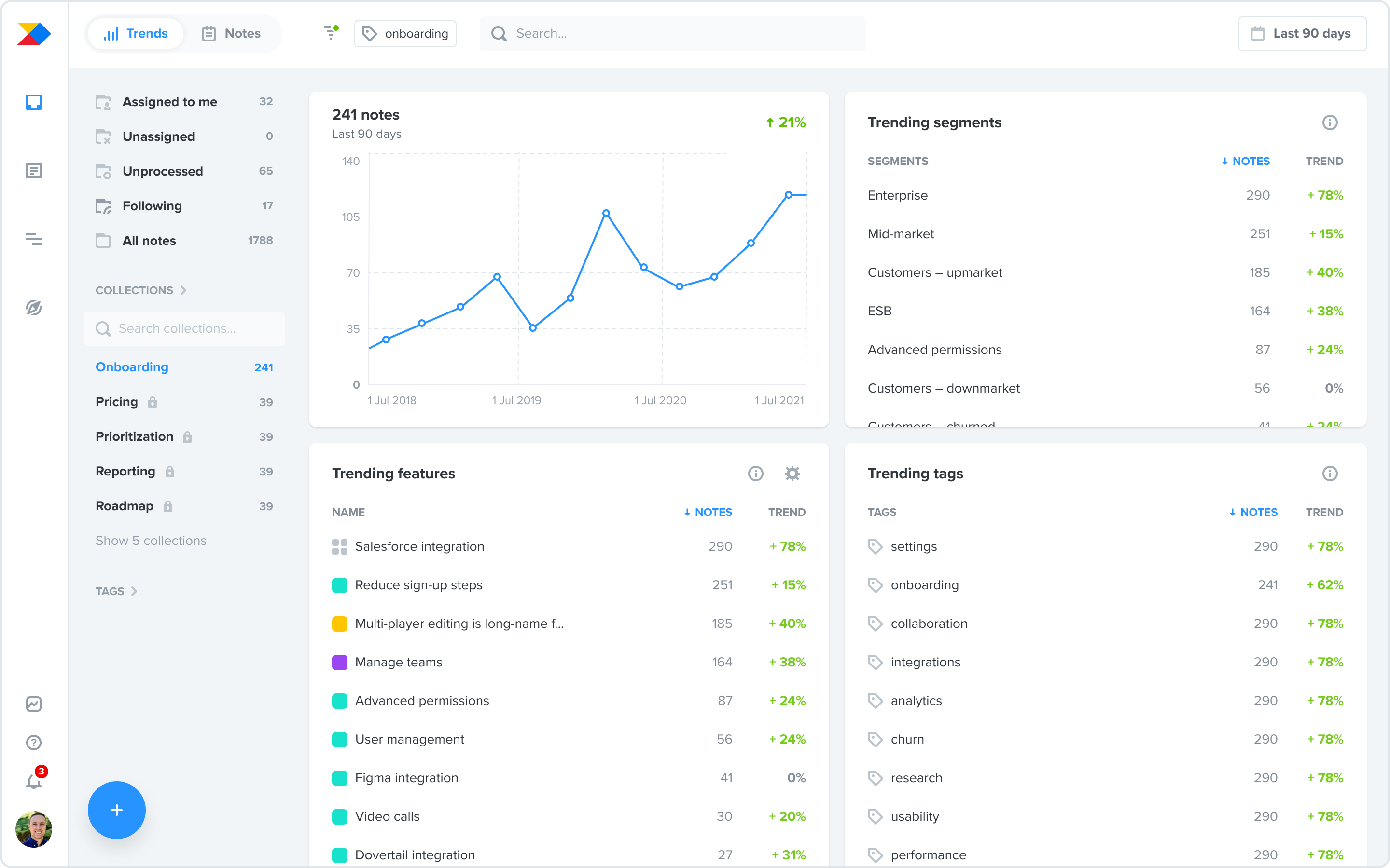
We visualised our ideas and assumptions as an early concept used for testing:
We interviewed 8 customers across segments with focus on upmarket customers. From those interviews we discovered three main jobs-to-be-done:
- Identify opportunities during planning in my product area or for a specific segment
- Analyse trends in time for specific topics when prioritising between multiple ideas or during post-launch analysis
- Never miss an important insight in customer feedback I haven’t yet reviewed
I also tested the early concept during those interviews. That gave us a lot of good insights about which solution ideas had potential. Ultimately, we identified several different possible solution directions:
- Optimise the Features board for trend analysis
- Create a new surface area in the Insights board with a trend summary
- Build a full-blown, customisable reporting capability
- Focus on summarising raw feedback using machine learning
Explorations for different solution directions
To choose the right direction, we had to consider our “appetite” — or how big of an effort we wanted to invest into this, and the vision we had for the Insights board: evolving it from an inbox to a place of continuous learning at scale.
All of our thinking led us to choose to create a new surface area on the Insights board with a trend summary as the best bet. It would allow us to move toward our vision and deliver value to customers reasonably fast.
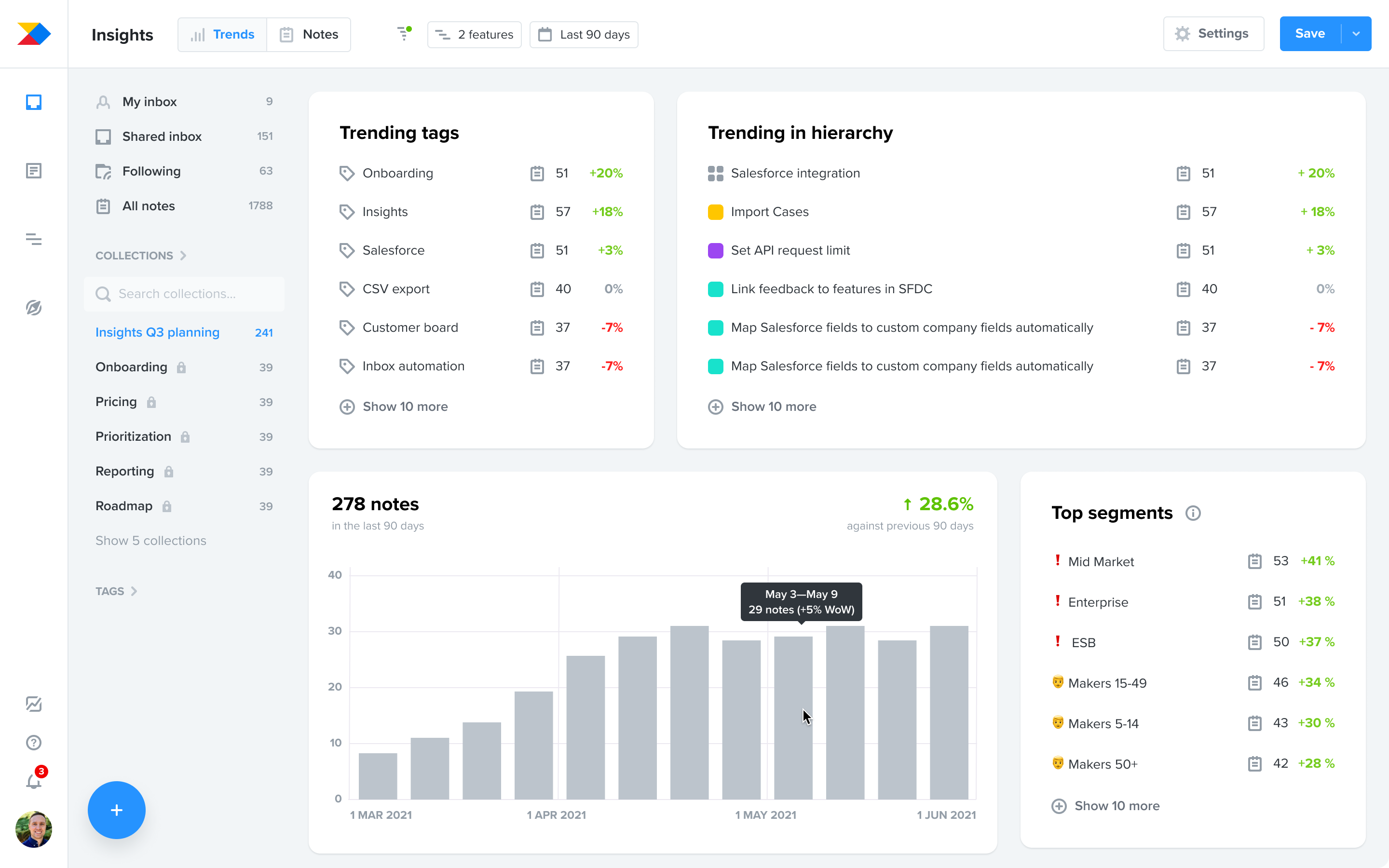
Designing the content
Deciding to build on top of the Insights board gave us a great foundation: powerful filtering of notes that we could use to summarize the data. It would also give users a lot of flexibility without building a full-blown reporting functionality.
The next question was: Which data points were the most useful to surface?
We collected a lot of data about this in our initial discovery. To progress, we ran workshops in our product trio (PM, designer, engineering lead) where we analysed the jobs-to-be-done — this helped us generate ideas around the type of data points we’d need in order to best support them.
We generated a lot of content ideas and focused on those which would best answer the questions above. After reviewing against the jobs-to-be-done, we ended up with 4 clear-cut modules:
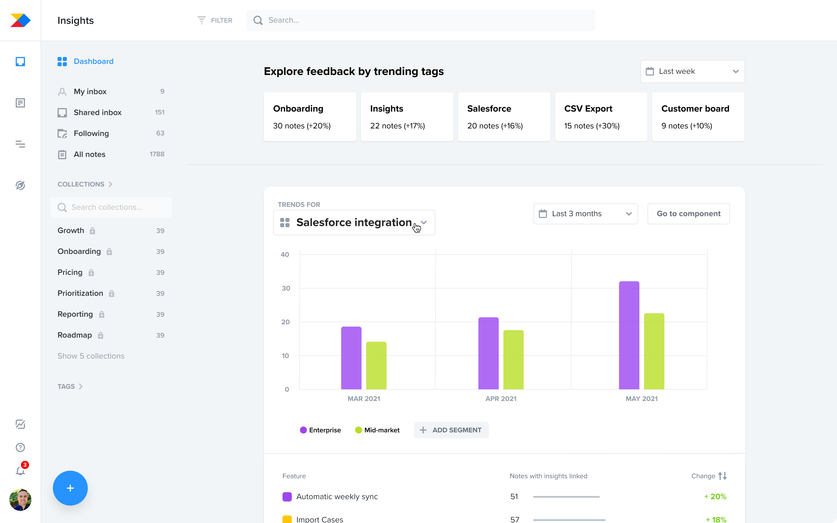
- Feedback volume over time
- Trending items in feature hierarchy
- Trending segments
- Trending tags
At this point, I turned these content ideas into a more refined design:
Moving beyond Figma to a live prototype for faster learning
Having clarity about the content, I prototyped our vision and we went to test our ideas with customers again.
While we learned something about what worked and what didn’t, it was quite limiting as long as we were using fake data. Customers struggled to understand the value of what we were showing them. Instead, we needed to show how the solution worked on customers’ live data.
We prioritised learning fast over polishing things up-front, so we made a plan for how to get this to market fast and decided to iterate afterward.
We cut out and built a very minimal and raw coded prototype that uses live data and we enabled it for selected customers in the beta programme.
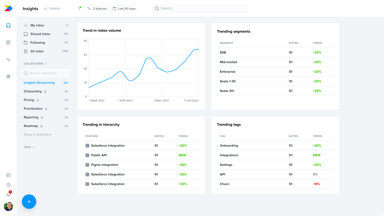
As you can see, we deliberately focused on surfacing the important data points without much regard to visual polish or additional functionality. No responsivity, no actions on individual items, and no configurability just yet.
We were ruthless in our cutting down, so that customers would get this in their hands as soon as possible and we could continue learning.
Iterating with customer feedback during beta
Once in beta, we started collecting the most valuable feedback so far. We interviewed customers while looking at what Trends were showing them with their data.

When we synthesised insights from these beta interviews in our product trio collaboratively, it gave us a lot of improvement ideas. We prioritised the most impactful areas where we saw the solution lacking the most.
Throughout the beta phase that lasted over 2 months, we iterated on the solution a lot — in terms of functionality, but also the design polish this deserved.
Below are some of our learnings and solution highlights.
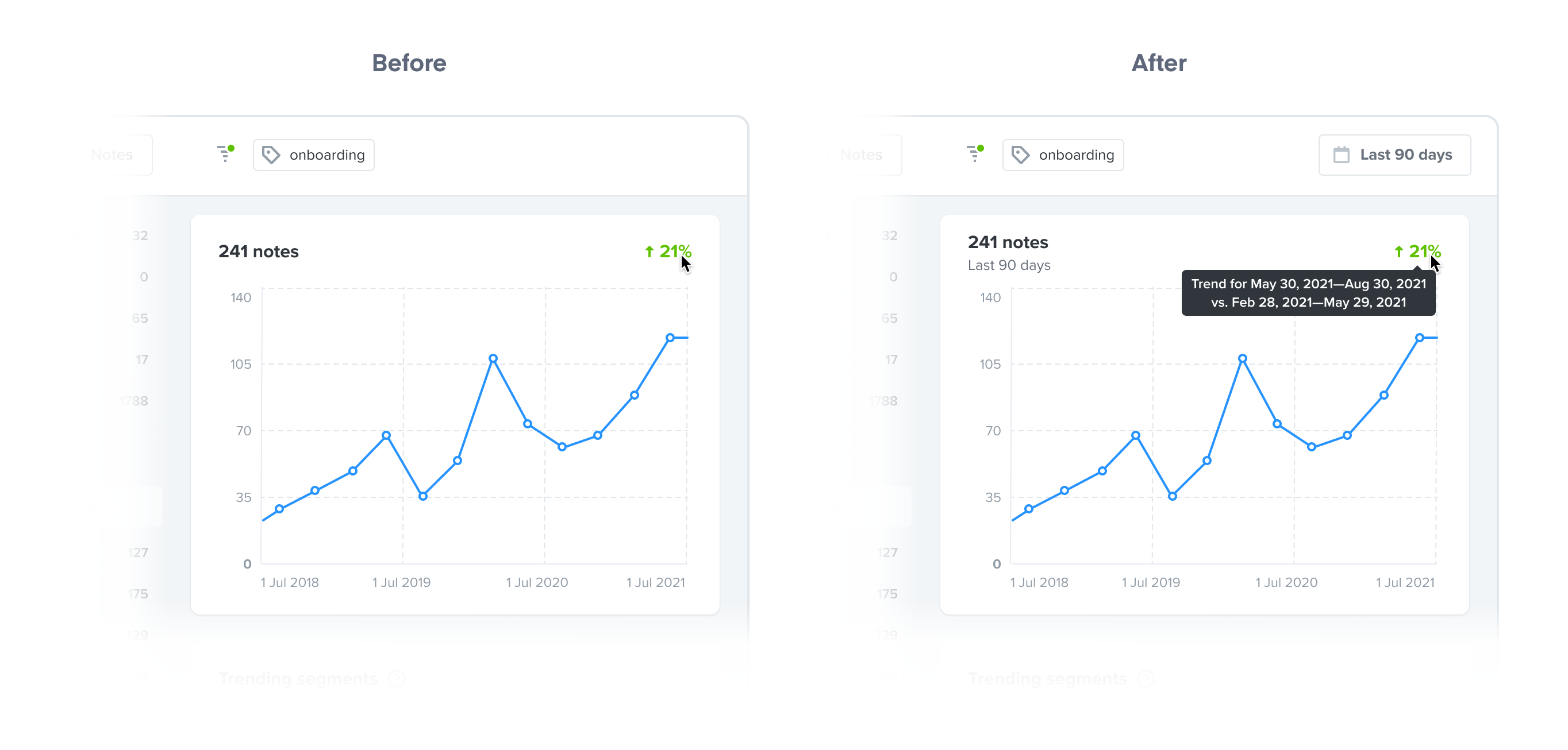
Understanding the time dynamics
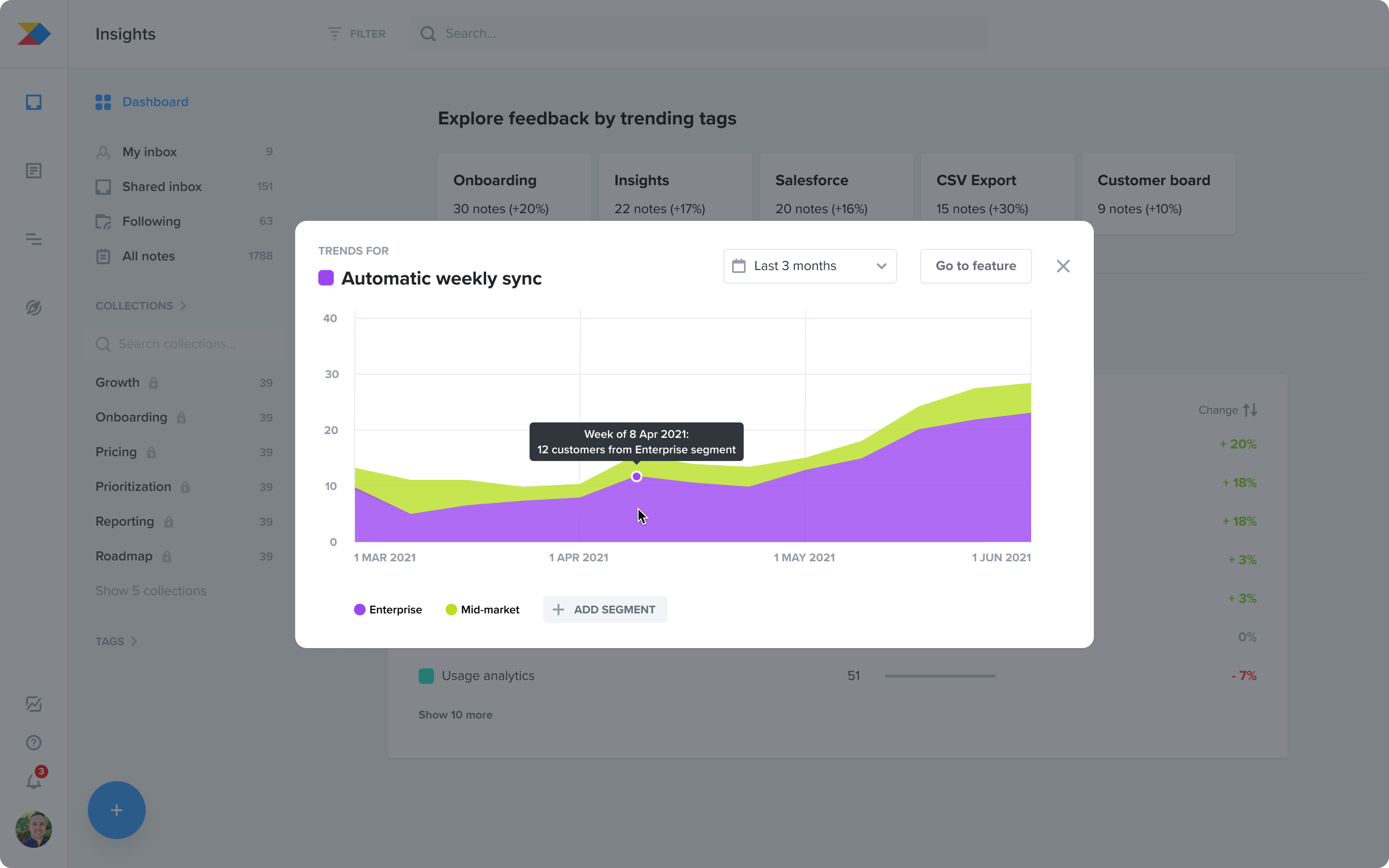
From early feedback, we saw that customers were unsure about the numbers we were showing them in relation to time. They were asking things like “What time frame am I looking at right now?” or “What periods of time are the trend % based on?”
To address this, we surfaced the time filter and added explanatory tooltips that spell out the date ranges behind each percentage. This helped with understanding. Surfacing the filter was also beneficial because adjusting it was a common need.
Discoverability of the navigation
Introducing Trends as an alternative data view on the Insights board created the need for a view-switching mechanism. Initially, we opted for a dropdown switch, mirroring the Features board, assuming user familiarity.
However, this proved problematic for user discoverability and convenience in accessing Trends, requiring two clicks. I pivoted to a segmented control for a one-click solution.
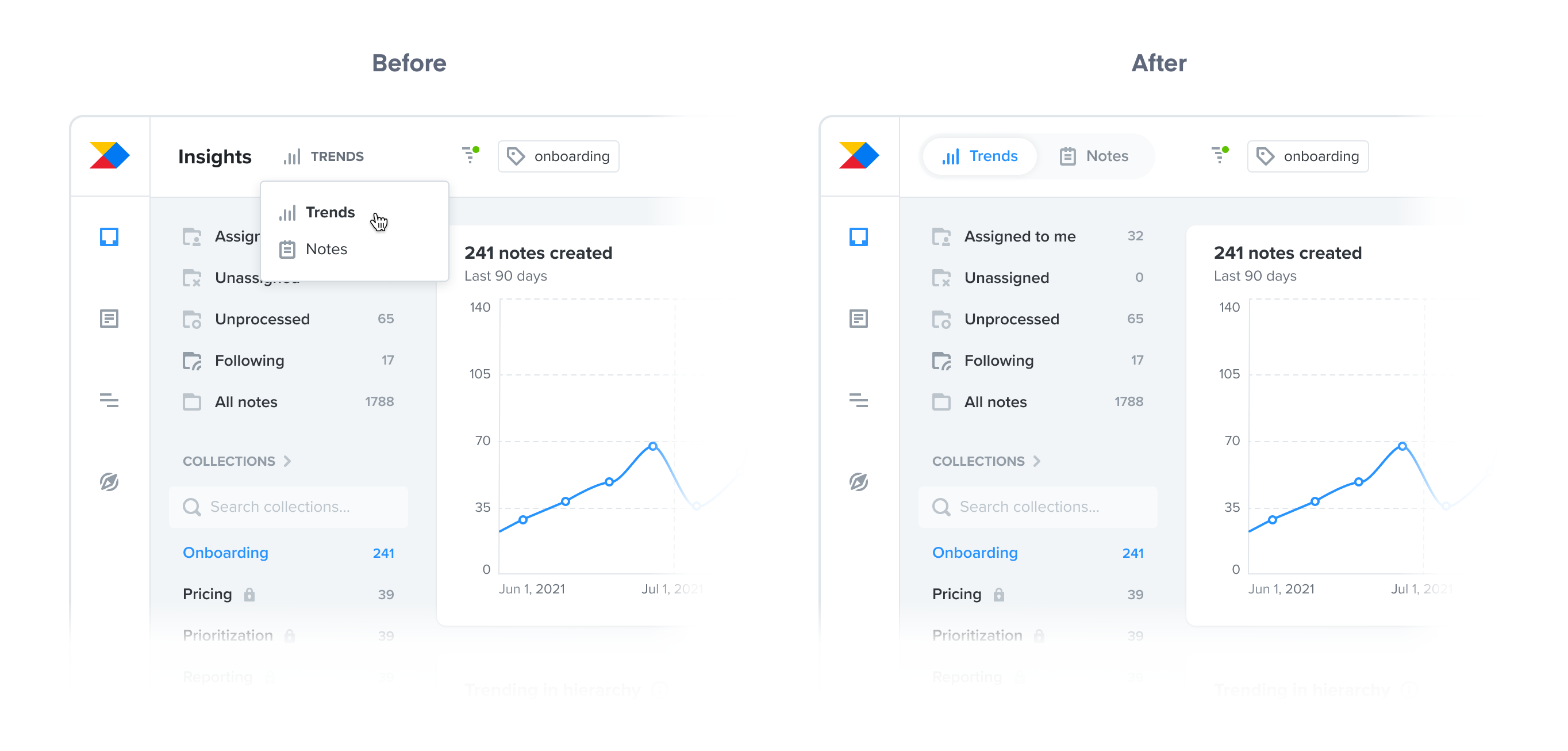
The result was dramatic: 80% lift in engagement. That was a big win for us since discoverability was more important than the consistency. The lesson? Obvious always wins.
The granularity of data for different roles
During the beta phase, feedback from product managers at all levels indicated varying needs for granularity in the "Trending features" module. Initially, we included only components and features.
This was enough for individual contributors but not for directors and VPs who required product-level visibility. Our interim solution was to add products to the module. However, recognising the need for flexibility, we ultimately implemented configurable options, allowing users to select their preferred hierarchy levels to view.
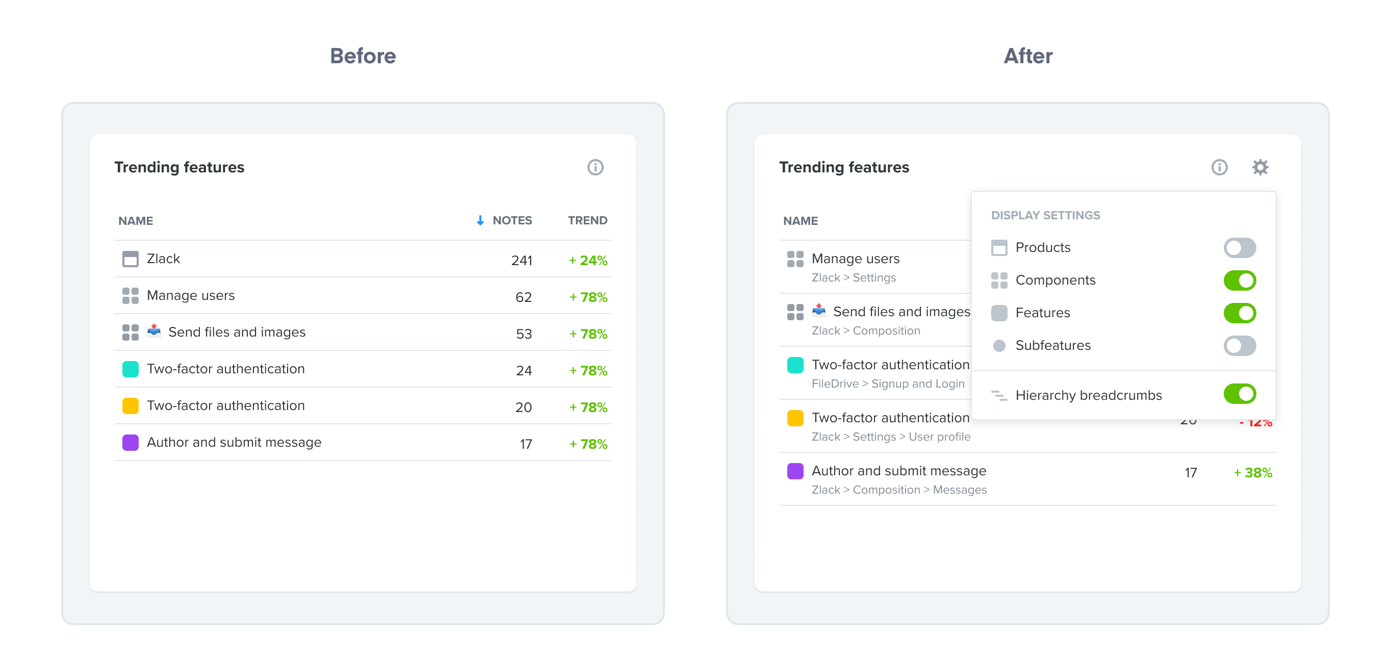
In addition, we also enabled customers to display breadcrumbs to understand where different features sat in their hierarchy. As we learned, this is especially useful when seeing features of the same name, but from different products.
“Drilling down” — filtering vs. opening details
From the start, customer feedback highlighted a desire to "drill down" into data, a need that persisted into the beta phase.
However, "drilling down" meant different things to different customers. Some wanted to add a filter for a deeper view on a specific item, while others wanted to access notes linked to a trending feature or view a detail of a trending segment.
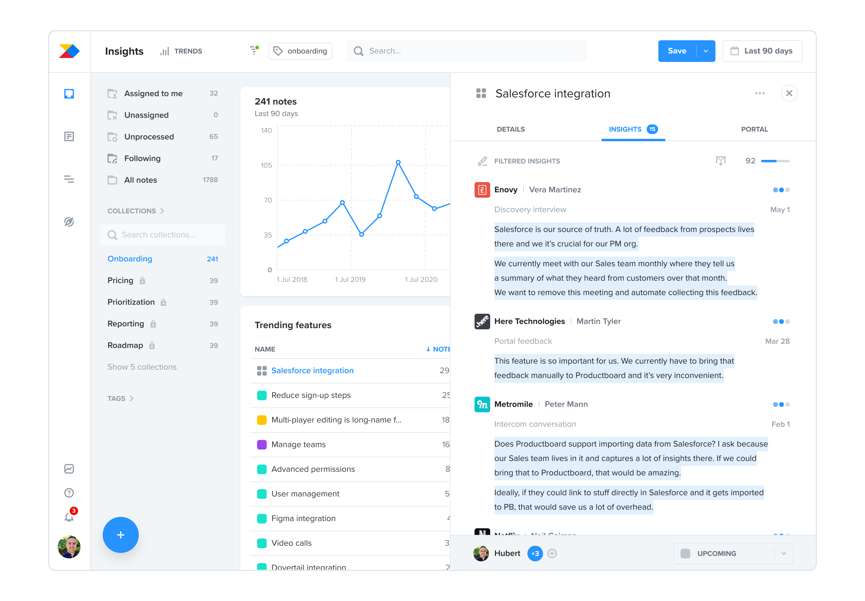
Implementing these features required varying levels of effort. Adding sidebars for item details was a more cost-effective option than creating drill-down filters, which would need a fundamental overhaul of the filtering system.
We chose the more pragmatic, cost-effective solution, aware that drill-down filters, despite their value, are a complex feature we might add in the future.
Responsiveness and a UI polish
Last but not least, we finally paid back the design debt of the live prototype by making the whole view responsive. We also worked closely with our design system team on improving the visuals of the underlying components.
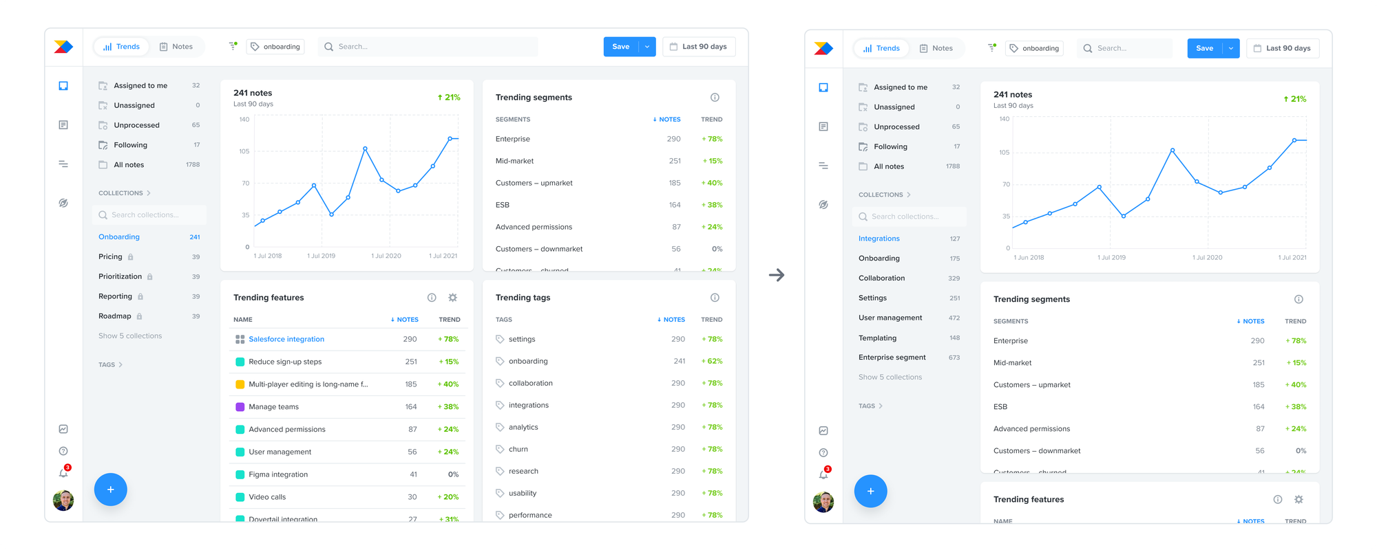
The result is a view that’s not only visually pleasing but more importantly, easier to consume and work with.
Launch and the impact
After a couple of months of iterating on the solution during private beta, we launched it to all customers on the Enterprise plan in December 2021. The timing of the launch was a mistake in hindsight as few customers had the bandwidth to adopt this feature before holidays.

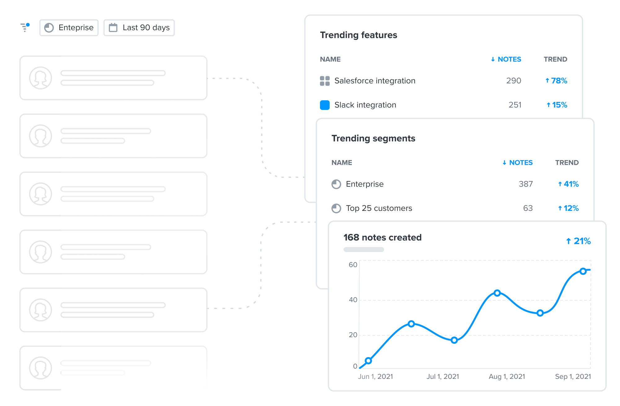
We started to see first engagement in January 2022 but it wasn't anywhere near our target. There was a product marketing campaign scheduled for March which would include Insights Trends. I collaborated with a product marketer on supporting visuals for the campaign that would be used across different channels from a landing page on the company website to campaign emails.
After the product marketing campaign, we saw a significant 31% increase of weekly active users of Insights.
We monitored this for another few months and crucially, this increase stayed – meaning that Enterprise customers have adopted the feature and we achieved our goal of increasing the engagement with Insights in Productboard.
Lessons learned
Reflecting on this initiative, there are a few important lessons that I take from it:
- The importance of product marketing: I learned how crucial good product marketing is for achieving the outcome. We could've done a better job of aligning the launch with product marketing campaigns and through that we could've achieved our outcome sooner and more efficiently.
- Pricing and packaging: Because the feature was available only on the highest Enterprise plan, most customers couldn't get value out of it. And while it helped with Enterprise plan differentiation, I believe including the feature also on the lower Scale plan (third out of four pricing plans at the time) would lead to a bigger impact in terms of engagement and thus retention of Scale plan customers.
- Obvious always wins: Iterating on the navigation discoverability during beta taught me to rely more on my intuition about what's obvious.